Visit my Patreon Page for more painting instruction and Paint Along Videos!

Tuesday, December 31, 2013

Where in the World Will You Paint this Year?

'Dreaming of Iceland'             9x12             pastel            ©Karen Margulis
Sold
I'll be painting in Iceland this year!  I have always had wanderlust.  I am the one planning the next adventure on the way home from a trip.  When I was in high school I worked 20 hours a week to save money for my two trips to Europe with my French class.  When my kids were young I would spend a year planning our summer vacations. We would take 3 weeks every summer and explore the National Parks. We did a Pacific Northwest Loop, a Southwest Loop, a Rocky Mountain loop and a New England loop.  I cherish the memories of those trips.

Now I go on painting trips. I've been to IAPS three times and the Plein Air Convention once. I went to Lake Tahoe for a workshop with Richard McKinley and several workshops in New Jersey with Stan Sperlak.

But this year I am going on my biggest painting adventure yet!  I am going on a Stan Sperlak workshop to Iceland. We will be based in a small fishing village and taking advantage of the long days to explore and paint. I really didn't know much about Iceland before I decided to go on the trip. But part of traveling for me is the joy of research. I have immersed myself in books about Iceland and I am trying to learn Icelandic (that is a challenge!)

The trip is in June and as always I will blog as much as I can from Iceland. So, we are all going to Iceland!  I can't wait!  Do you have any painting adventures planned? Feel free to share them in the comments!

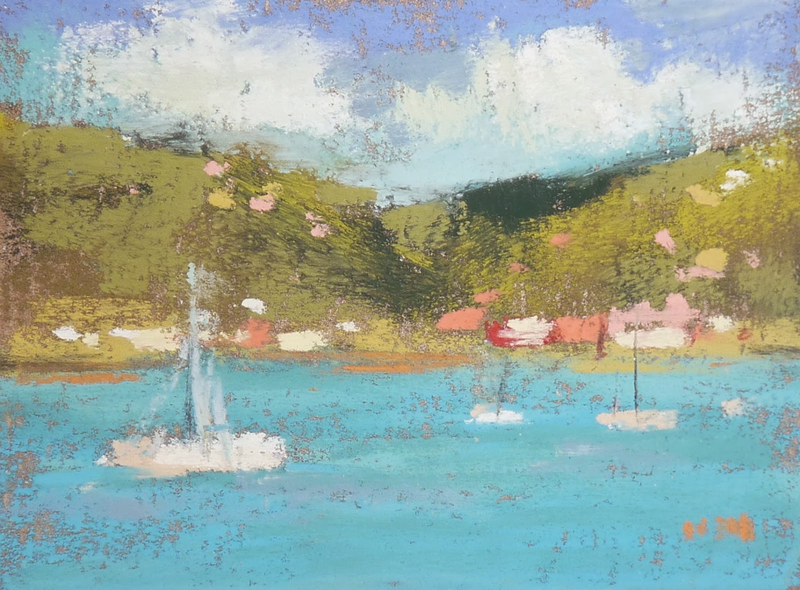
This painting is inspired by a photo by Hodur Viljahmonson on freedigitalphotos.net. It was done on a recycled piece of Uart paper.

Monday, December 30, 2013

Top Adventures of 2013...Painting in the Lowcountry

'Lowcountry Dreaming'             11x14            pastel         ©Karen Margulis
purchase at Daily Paintworks $145
 I have found my favorite spot in the South.  I could go back anytime and any season.  The place is Pawleys Island on the South Carolina coast.  For the second year my friends and I rented a wonderful cottage on the beach.  The cottage is named 'Wildlife' and it is very appropriate. Not for the way we act....we are far from wild often retiring at 9:00pm!  But Pawleys is filled with wildlife of the avian kind.
Wildlife at Pawleys Island
It isn't a commercial island. Just a peaceful place surrounded by the Atlantic ocean and the marsh. The birds love it and they make the marsh a special place.  We spent many hours just sitting on out dock watching the birds. On this last trip to Pawleys in October I painted every day.  I had my new Gogh Box and put it through it's paces. It was wonderful and I know that the many plein air paintings I did during the week will help me when I work from the photos I took.

The view from the back deck
 Days on Pawleys began by greeting the sun on our deck. Jayne would put on the coffee and give us a sunrise alert. This year we only had one good sunrise. It was overcast most of the time.  But it wasn't cold or windy so I can't complain.

The view from the front deck and our dock on the creek
Many hours were spent out on our dock. Even in the rain we could paint since it was covered. I had the pleasure of having some facebook friends come by to visit on the deck and watch a demo. That is a special memory!

I love adventure trips. The Southwest trip was one of them. But I also love these quiet weeks spent in a beautiful and inspiring place. I hope we get back to Pawleys in 2014!

Sunday, December 29, 2013

Top 5 Adventures of 2013....My AHA Moment


'Magic in the Air'            8x10           pastel         ©Karen Margulis
Click here to purchase $125

There is nothing better than when something clicks.  When it all comes together for a moment.  When you find yourself in the zone and your paintings are working. When the struggles and experiments start to make sense and you are finally finding your voice.

I experienced something like this a couple of months ago. It might have been the inspiring surroundings. Maybe it was coming back to Crow Creek.  It surely was helped by the instruction of Stan Sperlak. (I was at his Crow Creek workshop)  But whatever it was it felt good!

If you have been a regular reader of my blog then you may have noticed the changes my work went through over the summer.  After my Southwest Adventure I turned to a bolder more graphic approach to my paintings. I used bold black charcoal lines. I used flat areas of color.  I joked that it was due to the Vortexes in Sedona and surely it was the clear bold desert colors that was influencing my work. Here is one of my summer paintings.

Zion National Park          8x10        pastel 

But not everyone was a fan of this new style. I laughed when my mom told me she liked my older paintings better. I didn't have control over these new paintings. It is hard to describe but they just wanted to come out.  Some wrote and told me preferred  my softer more lyrical style.  I wondered if I would ever paint that way again.


It was at the Crow Creek workshop that it seemed to come together.  When I was out in the marsh painting in the wind with the clouds in living color....I painted with my heart. I didn't give though to technique or style. I just tried to capture the beauty and how I was feeling about it.  The paintings came quickly and with ease.  And I noticed something.....they were expressive but still soft. Yet there was an edge....an underlying boldness.  I felt then that my summer experiments with a bolder style had come full circle. This was how I want to paint!  (for the moment that is!)

This was my AHA moment for 2013. I look forward to many more moments in 2014.

Today's Painting was done from one of my plein air studies done at the Crow Creek workshop. It is on Multimedia pastel board. Which allows for a build up of texture.


Saturday, December 28, 2013

Top 5 Adventures of 2013...The Great Southwest IAPS Adventure

'Desert Sandstorm'           8x10           pastel        ©Karen Margulis
sold

 It was a dream come true.  Spending 4 weeks wandering around the Southwest with my best friends. It was definitely a highlight of the year.  It began with a drive from Atlanta to Albuquerque to attend the IAPS Convention. IAPS stands for International Association of Pastel Societies.  The convention is held every two years in Albuquerque and it is not to be missed for pastel artists.

After the convention we hit the road making stops at Canyon de Chelly, Monument Valley, Capitol Reef National Park, Bryce Canyon and Zion National Parks, Grand Canyon and Sedona!  It was amazing.  I brought along a small pastel kit and painted a 5x7 pastel every day and posted a trip report to the blog. You can go back in the archives and see posts and paintings.  Click on June 2013 (on sidebar on the right)

underpainting for today's painting

About today's painting:  During the convention artists would get together and go paint. The scenery around Albuquerque is awesome!  I went out with a group of artists one late afternoon. We arrived at the location which overlooked the Rio Grande just as the weather was starting to go downhill.  A large sandstorm was quickly approaching.  It was very interesting to see the storm race across the desert.

 I took some photos and did a quick sketch.  This painting was done from my photos.  I used an old unfinished painting on Pastelbord. I first brushed rubbing alcohol over the old painting creating a green- purple underpainitng. It was perfect for the dramatic clouds.


Daily panting done in Zion National Park   5x7  pastel
The Great Southwest Adventure was a full of wonderful memories. I am looking forward to the next IAPS convention in June of 2015.  If you love pastels you will want to make plans to attend!

Friday, December 27, 2013

Top 5 Adventures of 2013 ...Doug Dawson Workshop

'The Clearing'              8x10               pastel            ©Karen Margulis
click here to purchase $125
 I am so excited about the adventures I have planned for 2014.  Before I share them with you I'd like to take some time to look back on 2013.  I had some excellent adventures and most of them involved travel and art....two of my favorite things!  For the next few posts I will be looking back at 2013 and sharing some of the highlights.  I am also doing a new painting to illustrate each adventure.  I hope you enjoy the posts!

I begin with the Spring of 2013.  It was all about pastel workshops. I love taking workshops both for the things I learn and for the camaraderie of my fellow artists. There is something wonderful about having a few days devoted solely to art. (It is also a great way to see the country when a workshop involves travel!)  In the Spring of 2013 I took two workshops....one with Doug Dawson in Florida and another with Elizabeth Mowry here in Atlanta.  They were both excellent workshops and very inspiring. You can read more about them here:


Doug Dawson shared some things that have had a big impact on how I approach a painting. He shared his method for doing thumbnails and blocking in a painting.  I love his approach!  One of the exercises we did in the workshop was to do a few thumbnails from our photos. For today's painting I used one of the thumbnails I did in the workshop but didn't have a chance to paint.

Block in colors and thumbnail
 In the photo above you can see the photo along with the black and white thumbnail. I chose 4 values of red for the block-in colors. I worked on a piece of Burgundy Canson paper with mostly Terry Ludwig pastels.  Be sure to go back and read my March 2013 posts for more details on what I learned in the workshop. (see the archives on the sidebar)

Block in by Value
 Here is the finished block-in. I like the abstract quality of the block-in.  I built up the layers of grasses using workable fixative in between each layer. I used very soft pastels to make the marks for the flowers. I used the sharp edge of the pastel to create the thinner branches.


Tomorrow I share another adventure and painting so be sure to come back!  What adventures did you have in 2013?

Thursday, December 26, 2013

Review of My Ultimate Travel Pastel Kit


'Caribbean Harbor'            2.5 x 3.5"        pastel        ©Karen Margulis
Sold
How small can you go and still have enough supplies to paint with? I put that question to the test on my cruise last week. All I brought was a small zippered book cover with a small box of pastels and a pile of 2.5x3.5 paper.  It was more than enough to allow me to paint without wishing I had more.

It was simplicity at it's finest. 

The bag was lightweight and fit in my backpack and beach bag. It has a handle as well but it is so compact it will fit in a bag or even larger purse. Set up and clean up was quick and easy. (nice when a tropical shower popped up)  I had more than enough pastels....as long as you have the right values then you don't need as many colors.  I made sure to bring the right turquoises since I would be in the Caribbean. 
Below is a photo of the kit set up on my poolside lounge chair. I brought along some photos but also painted the island scenery from the ship deck. The top painting was done while we were docked in Tortola.  This is by far my best small kit yet. I was even able to lay back in the lounger and balance the pastels while painting....the laziest painting session ever!

My Ultimate Pastel Travel Kit in Action Poolside

It was an active cruise so between the snorkeling and horseback riding I didn't paint a lot but I did manage to paint 20 petite pastels each measuring 2.5 x 3.5.  

Special Offer!
I am listing the paintings in my Etsy shop and as a special offer, if you purchase a painting for $15 you will also be entered into a drawing to win an enlargement of your mini painting. If you win,  I will paint your mini up to 11x14 size. So be sure to check them  out. Your chance of winning is very good! Winner will be selected on January 31, 2014.


All of the paintings can be seen in my Etsy shop
http://www.etsy.com/shop/KarenMargulisFineArt?section_id=10874425

Wednesday, December 25, 2013

Winter Pastel Paintings...YouTube Slide Show

'Winter'        5x7       pastel    ©Karen Margulis.   $50
Art set to music. It is a perfect combination. I am still fairly new to You Tube and discovering the great videos available to artists. So I was happy to find that I could quickly and easily make a slideshow of my paintings and set it to music.

The key for me is that is was Quick, Easy and Free.  What could be better!  It is also very easy to share your slideshow. You Tube provides the link as well as the code to add it to your website and blog.

You need a You Tube account and once signed in click on the Upload button. There you have several choices with one being 'photo slideshow'.  Click 'create' and follow the directions. Very easy!  Have a look at my first try:


Making a video slideshow is a great way to share a collection of your work. I can't believe I waited so long to try it!  I am offering several of the winter landscapes for sale in my Etsy shop.
Here is one of the auction paintings:

'Down a Winter Path'        8x10     pastel


Tuesday, December 24, 2013

How to Paint Snowflakes...Making Pastel Snow


'Snow Painter'   Snow Person pastel 2013         6x8         ©Karen Margulis
click here to purchase $65
Let it Snow!  There is something special about a White Christmas. Not a stormy icy snow but a gentle snowfall that makes us grateful to be inside with family and friends.  We don't often get a White Christmas in the South and we aren't expecting one this year so I decided to make my own pastel snow for my annual Snow Person painting.

A Recipe for Pastel Snow
After I painted my Snowman I wanted to add some snow. After all he is an intrepid plein air painter. He is not afraid of a little cold and snow. As long as he has his Gogh box he can set up and paint in just about any condition.

How can we paint snowfall or snowflakes without painting a bunch of white dots?  

  • One way is to create a paste of shaved white or pale value pastel shavings and a bit of water. You then take a stiff brush such as a stencil brush or old toothbrush and dip it into the paste. Decide where you want the snow and run your finger over the brush creating a splatter of the white paste. When the splatters dry they will be stuck to the paper. If you get specks of wet on the paper don't worry. They will dry with no change to the pastel.
  • Another method for creating a snowfall effect is to use the dusting technique. Simple shave a white pastel over the area of the painting where you want snow. I use a palette know to make my shavings. Bigger pieces make bigger flake.  Then press the pastel dust into the paper with the palette knife or a rolling pin. I like to put down some glassine paper before using a rolling pin.
I wish all of you a very Merry Christmas and Happy Holiday Season!  

Monday, December 23, 2013

Painting Shadows on Snow with my New Pastels

'Winter Blues'         10 x 10           pastel            ©Karen Margulis
click here to purchase $145
I am back from the beautiful blue Caribbean Sea to the blues of Winter. We have no snow here in Georgia, only rain. Lots of rain. I really need to be unpacking and baking for Christmas but I was itching to get back in the studio and paint something!

My newest pastel acquisition was calling out to me.....Paint something with us today!  These are my new Diane Townsend pastels... a set of 12 blue Terrages. They would be fun to try out on a snowy landscape!  So I dug through my winter reference photos to find something suitably frosty!

Diane Townsend Terrages Blue Collection
If you haven't tried Terrage pastels you are missing out on a fun to use pastel. Here is some information about Terrages from Diane Townsend's website:

Terrages Pastels are larger pastels containing crushed pumice stone which enables the artist to open up the surface of paper and work in more color. The added pumice will also help create complex layers of color and a luminous sensation of depth and space. Terrages pastels are made in a size and shape that can accept a more forceful application without crumbling.

What I love about them is the shape. The thick and wide pastels fit nicely in your hand and allow you to cover a lot of paper with few strokes. I do like the idea that you can be more forceful without them exploding in your hand. But what I like best is that the shape prevents you from getting too detailed and fussy. It is about making big juicy strokes.

The blue Terrages were wonderful for painting the shadows in the snow. The coverage was thick and juicy so that I didn't even do an underpainting or block-in. I just went right in with the Terrages on my Uart paper.  I did use some Terry Ludwig pastels and some Diane Townsend lights in the painting but most of the shadows are Terrage blues.

detail of blue shadows on snow
Tip for Painting shadows on snow:
Most of the time when I paint the shadows on snow I try to use warmer blues (turquoises) in the foreground shadows and purples and pale cooler blues in the distant shadows. I remember that atmospheric perspective would cause the warmer colors to be lost in the distance so I apply that to the blue shadows as well.

I am now back to regular blog posts. The ship's internet connection was painfully slow and I wasn't able to get my scheduled post to publish. So I had a technology break of sorts but now I am back to the studio and the computer!

Tuesday, December 17, 2013

Hello from St Thomas

Lounge Chair Painting

 It is sunny and warm here in the Caribbean. I am enjoying the weather and the relaxation. Today I snorkled with my GoPro camera and got some fun underwater video that I can't wait to edit!
On the ship I have been using my ultimate travel kit to paint some mini pastels. I love it !! It is the perfect size for throwing in the beach bag. I'll post more about it when I return but since we have phone service in St Thomas I thought I'd check in!  Here is my kit on my lounger and today's painting is one if the minis I painted.


Sunday, December 15, 2013

Cloud Demo...Puffy White Clouds

'Passing Clouds'             11x14            pastel         ©Karen Margulis
available for purchase in my Etsy shop $165
I am fascinated by clouds. I search out opportunities to put clouds into my paintings.  I love all types of clouds....white puffy clouds to dark stormy ones. I am drawn to painting them.  But clouds can be challenging to paint. The struggle is to make them look like they are a part of the sky and not stuck on like cotton balls.   

I have learned some great sky and cloud tips that have helped me.  I am working on a mini booklet on painting skies and clouds filled with the pearls of wisdom I have collected.  In today's demo and this week's blog posts I will be painting clouds and sharing some tips.


I am working on 11x14 Wallis Belgian Mist. I will do not underpainting or block in but get right to the painting with my softest pastels. I am using Diane Townsend pastels. I start by putting in the darkest colors which is the land.


Next I begin with the sky and put down some cool dark blues using the side of my pastel.


I continue to lay in the blues of the sky getting progressively lighter and warmer. Near the horizon I use pale pinks.


After all of the sky colors are put in I add some lavender for the start of the clouds. Then I blend all of these colors together with the side of my palm.


The next step is to build up the clouds. I start with the dark bases of the 'puffy white clouds'. I use lavender, peach and green.  The thinner wispier clouds can be lightly scumbled on top of the blue sky.


 I needed to darken the cloud bases somewhat by adding a gray purple. Next I add the light part of the clouds using pale peach and pale yellow....they are so pale that they are near white. I don't use any pure white.  Finally I work on the ground plane. I just add some reds and ochres and dark greens.  I don't put any detail in the foreground as this painting is all about the sky. (see top photo for the finish)

Friday, December 13, 2013

The Most Portable Pastel Kit Ever!

'Santa Comes to St. Thomas'         5x7           pastel         ©Karen Margulis
I am headed back to the Caribbean!  I am taking a girls Pre-Christmas Cruise with my Mom, sister and daughter.  All I want to do is relax! I have a pile of books to read and my new GoPro camera to play with.  I wasn't even going to take any pastels.  I know.... I have the Gogh Box. I have my small kit that I took on my Southwest trip.  But I thought it would be a good thing to just take my sketch book and just take pictures, sketch and observe.  A Painting Break might not be a bad thing.  And I may do it.

But just in case I got an overwhelming urge to paint I need to have some supplies!

So I put together my smallest pastel kit ever.  If you saw my Black Friday Haul video yesterday then you got a sneak peek at my kit.  Here is is below. Let me describe what I did:


Everything I need to paint small pastel paintings (5x7 or less) fit nicely in this soft-sided Bible cover.  This is a zippered book cover that measures 8x10 and has two outside pockets. Oh and it is even reversible!  I paid $8 for the cover. 

To outfit the kit I filled a small Terry Ludwig pastel box with a selection of pastel pieces. I wanted an assortment of darks and lights and then filled in with middle values.  I really needed a bit more space for some Nupastels and charcoal so I filled up a small 4x4" box.  I made sure the boxes had two layers of foam and I used rubber bands to keep the lids secure.  It is important that you can't hear the pastels move when you shake the box. Here are some of the other supplies I fit in the kit:
  • My backing board which is a piece of 5x7 foam core that I put in a Clearbag for protection.
  • A small bulldog clip to clip the paper to my board.
  • baby wipes...travel size
  • A small notepad to slip the finished paintings into....I happened to find a nice travel themed plastic coated notepad!  I am using a binder clip to keep it closed so the paintings won't fall out.
  • A selection of papers. I am going to paint minis....2.5x3.5  but paper up to 5x7 will fit in this kit.
  • A small watercolor kit (in a pill case) and a water brush.


my pastels

The kit all zippered up and ready to travel!
I love this little kit. It will fit in my backpack and my beach bag so if I really need to paint I can.  Just know it is there should be enough to keep me from having withdrawal. But it is so cut I may just have to use it!

While I am away I have prepared some of my favorite posts from 2013. Internet on a ship is slow and expensive so I will do my best to get the posts published but if you don't hear from me I'll be back online on December 22!

Thursday, December 12, 2013

Do You Have Your Magic Frame?

'Morning Softness'            8x10           pastel           ©Karen Margulis
click here to purchase $125
 Every Artist needs one. I have several. A gold one and a black and dark wood version. I even have a few sizes.  I think it is one of the most important studio tools we can have.  I am talking about an empty frame.  I call them my Magic Frames.  When I put the Magic Frame up to a student's painting it is amazing at the response I get.  There is always amazement at how finished a painting can look in a frame.

It may not be completely finished but the Magic Frame has saved many a painting from getting 'finished off'  (southern talk for overworking a painting)  The frame isolates the painting and removes the distraction of clips, tape and dirty boards.  Without these distractions the painting can be evaluated. Decisions can be made about what is working and what else is needed.

The Magic Frame allows us to see out paintings better but more importantly taking the time to put a frame up to the painting and step back forces up to STOP.  If we don't stop, step back and look we may start overworking in our quest to finish.


One of my Magic Frames
I like to use simple Plein Air Frames which seem to work well with most of my paintings. But here is another tip.....Use a Black Mat....I have several Magic Mats that I use for the same purpose.  I had black mats cut in my most common painting sizes.  These are easier to store and bring to classes.  No matter what you choose, consider making a Magic Mat or Frame a part of your painting routine.

Wednesday, December 11, 2013

My Black Friday Art Haul.....New Vlog

'The Snow Painter'           5x7         pastel        ©Karen Margulis
sold
 What is a Vlog you may be asking?  Or you may already be hooked to some popular YouTube vloggers. A vlog is simply a blog in video form.  Here is the Urban Dictionary definition of Vlog:


1. vlog
A video log. A journalistic video documentation on the web of a person's life, thoughts, opinions, and interests.
A vlog can be topical and timeless, instructional and entertaining. The main thread is trying to communicate on a personal level with your audience.


Last Spring I started my You Tube channel and posted a few videos and called them 'What's in my Studio'.  Now that I have my new GoPro video camera it will be easier to add videos to my channel. So today I have posted my latest installment to my channel....

My Black Friday Art Haul


A sneak peek at the great stuff I got on Black Friday/Cyber Monday
I did some shopping for art supplies over the Black Friday weekend.  Online art stores had good coupons but I found most stuff in regular discount stores!  You just never know what you might find for art in just about any store. I am always looking for ways I can repurpose things for art.  Of course I will be writing more detailed blog posts reviewing all my finds but the video gives you a sneak peek!

Here is the link to my video:http://youtu.be/w9kvTPFHwUM


Tuesday, December 10, 2013

Why Pastel Painting is Like Fine Wine

'Lap Warmer'             8x10              pastel           ©Karen Margulis
click here to purchase $125
I wanted it very dark. I knew that a dark background would set off the warm sunlit fur of my cat. The photo I was working from showed the background as black. Photos often do that to shadows and dark areas.  But I didn't want to use black.  I rarely do. It tends to be dull and lifeless. I needed liveliness and complexity!  That's when it occurred to me.

Layering pastels is like a fine wine.  

Layering makes a painting lively and complex. Consider these two words we use to describe wine (from Sunset magazine)

COMPLEXITY. A complex wine has multiple layers of flavors and aromas. Each sip reveals something you didn't notice before. Complex wines are more fascinating than their opposites ― simple wines.

FRESHNESS. A wine that tastes clean and lively is often described as fresh, a sense that often stems from its natural acidity. A wine with too little acidity frequently tastes bland and dull, or flabby.

We can have a simple, bland and dull painting or we can have a fresh, lively and complex painting. It has a lot to do with the way we layer our colors.


single color wine vs. complex wine

How does layering pastels compare to wine?  Consider the illustration above.  In the glass of wine on the left I used one layer of pastel. It was a dark wine so I used black. I could have used dark red or dark blue. The important thing is that I have only used one layer of dark pastel.  Dull, flat and boring!

In the glass on the right I used four layers of dark pastels, dark blue, green, dark purple and dark red. I layer them lightly and they mix and mingle and blend together. Click on the photo to enlarge and see the subtleties of the colors.

The glass on the right has more liveliness, complexity and interest.  This is what I try to do when I layer my pastels. If I am building up an area....whether it is dark , middle, or light value.....I don't use just ONE pastel. I layer several pastels that are all the same value. This creates a much more interesting painting.

So next time you are painting....remember that glass of wine. Which would you rather drink?

Monday, December 09, 2013

Choosing an Underpainting Color


'Tomorrow's Promise'               12x24              pastel              ©Karen Margulis
click here to purchase $225
 It has to be my most popular question. The funny thing is that there is no right or wrong answer. Only possibilities.  The question is about choosing colors for an underpainting.  We often wish there was a black and white answer.....I would be very popular if I came up with an underpainting color chart. Wouldn't that be fun....a chart that tells you what underpainting color to use for a certain subject?  But that wouldn't be a good thing.

If every artist made the same color choices our paintings would all look the same!

The beauty of art is that we have choices and possibilities.  Sure there are some general guiding principles for choosing colors. Certain colors or toned papers will effect the way the painting will ultimately look. Colors can create a mood or make the other colors used in a painting appear different.


I chose a warm underpainting in reds and oranges to create the warm glow of the sunset

The only way we will know how the colors will interact is to try them and see what happens. Practice and experience with many different underpaintings will lead to more intuitive choices.  If you have experienced what red does under green for example then you will have a better idea of when to use it.

So take the time to experiment. One of the best exercises I ever did was Richard McKinley's Underpainting exercise. He recommends doing the same simple painting with the same colors on 9 (I think) different color surfaces and underpainting types. The details are in his wonderful book Pastel Pointers.  Try it and I promise you will not regret it. You will learn so much about choosing underpainting colors.